Table of Contents
Apple is one of the world’s most influential companies. The brand has gained a strong and loyal customer base by creating and selling high-quality products based on innovative design principles. But Apple wasn’t always a success. The company went through its struggles and failures before becoming the renowned brand it is today. Apple’s strong branding is spearheaded by its iconic logo design. What’s the story behind Apple’s famous logo?
When was Apple established?
Apple Inc. was founded in 1976 by Steve Jobs, Steve Wozniak, and Ronald Wayne. Two weeks after the company was formed, Wayne sold his interest in the company for $800.
The company was established during a time when technology was still in its infancy and computers were bulky and troublesome to use. Apple’s wanted to make computers more user-friendly by making them more portable.
How did Apple get its name?
There are many theories regarding Apple’s brand name and its origins. Some of these theories include:
- The brand name was inspired by Eve’s bite out of the apple.
- The story of Nymphus gaining immortality by eating a golden apple.
- Alan Turing, the father of modern computing, died after eating a poisoned apple.
- From the famous saying: “an apple a day keeps the doctor away.”
- Some claim that the three founders wanted a more casual name.
- Steve Jobs and Steve Wozniak wanted the Apple brand name to appear before Atari in phone books.
and in our country, some Hindu scholars, including Anirudhacharya, have claimed that Neem Karoli Baba gave Steve Jobs the name for his company, Apple. However, Steve Jobs visited India in 1974, a year after Neem Karoli Baba died in 1973. This discrepancy raises questions about the validity of these claims. To set the record straight, here is the authentic history of the Apple logo.
But in reality, Steve Jobs named the company Apple because he liked the fruit. Steve Jobs followed a fruitarian diet and suggested the name Apple to Wozniak after Jobs visited an apple orchard.
The Evolution of the Apple Logo

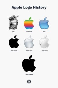
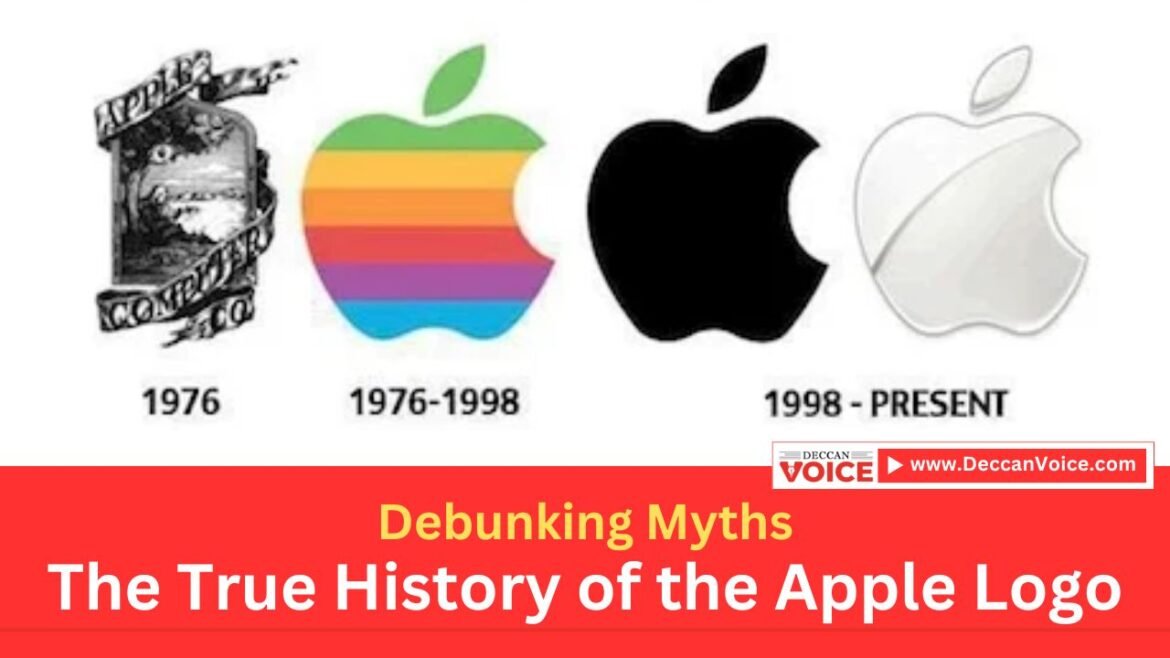
1976: The First Logo
The first Apple logo, created by Ronald Wayne in 1976, depicted Isaac Newton sitting under an apple tree, a far cry from the sleek design we recognize today. This detailed illustration represented the discovery of gravity, reflecting Apple’s innovative spirit.
1977: The Rainbow Apple
In 1977, graphic designer Rob Janoff introduced the iconic rainbow apple with a bite taken out. This design symbolized Apple’s mission to humanize technology, making it more accessible and user-friendly. The colorful stripes also indicated Apple’s commitment to color graphics.
1998: The Monochrome Apple
With the release of the iMac in 1998, Apple transitioned to a more modern, monochrome logo. This sleek, minimalist design signified a new era for Apple, emphasizing simplicity and elegance.

2007: The Glass and Chrome Apple
In 2007, Apple introduced a glass-themed logo with a glossy finish, coinciding with the launch of the iPhone. This version reflected the company’s innovative approach and cutting-edge product design.
2013: The Flat Design
In line with contemporary design trends, Apple adopted a flat, two-dimensional logo in 2013. This clean and simple look aligns with the design principles seen in their products and software interfaces.
Conclusion
The history of the Apple logo showcases the company’s evolution and commitment to innovation. While myths and misconceptions may arise, understanding the true origins of Apple’s iconic symbol helps us appreciate its journey and impact on the tech industry.


